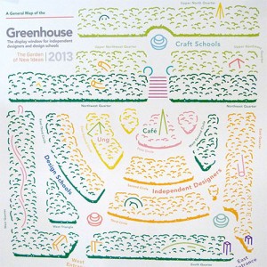
One of things that makes the S tockholm Furniture Fair one of my favorite design shows, is Greenhouse. Entirely dedicated to new designers, this area showcases products that have never been shown before and are not yet in production, making this a really exciting place to see new design thinking. This year, the space was designed by Note Design Studio . Susanna Wahlin, Interior Architect at Note told me: “We were thinking about what it’s supposed to be and why it’s called Greenhouse. We took inspiration from baroque gardens – they were a place to socialize, to experience beauty, where you can meet and mingle, and experience each other’s ideas. This year, we’ve called it ‘the garden of new ideas’, so we’ve removed some of the walls that are normally between the exhibitors, so the new ideas could really meet, so that both the exhibitors could talk with each other, but also so the audience could ‘dare’ to step inside.” Alexis Holmqvist, AD and Graphic Designer at Note added: “When you have deep walls you have to put the stands in a row, when you have shorter walls you can have softer curves
Continue reading here:
Greenhouse at the Stockholm Furniture Fair 2013
Related posts: