April 23rd, 2013 — Designer Stuff


Happy Monday! Today we’ve got a great post about bringing in light into your home – something super important and mood-lifting as we enter into the warmer seasons!
When decorating, we all want to create the illusion of having more space than we actually have. Even if we have large rooms, we still like to feel we are in a bigger room with nothing to get in our way, right?
There are numerous handy tips and ideas on how to make a space seem larger and lighter by using mirrors and reflective surfaces – and here are a just a few of them:
Natural light line
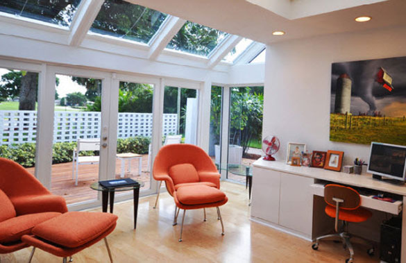
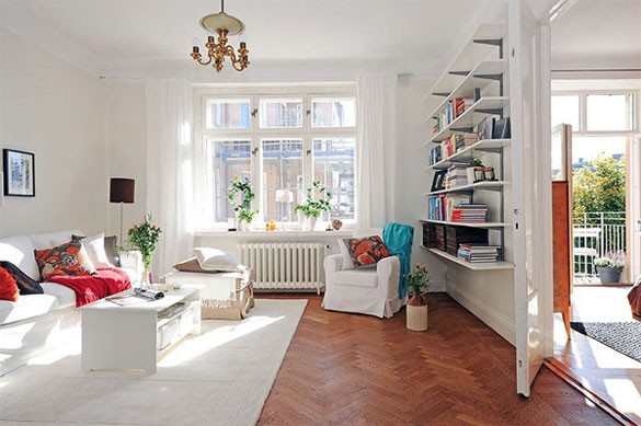
One key aspect for increasing the light in the home is to assess the line of natural light that is entering the room. You need to think about what times of day you are most going to be in the given room and see where the natural light comes from at this time.
From this you can consider strategically placing a mirror or mirrored surface in the direct path of the natural light. The mirrored surface will project further light back into the room, helping to make it light and airy. You will not actually increase the light level, but give the illusion that the room is lighter than it is.
This is great for rooms that are small or that don’t get a lot of natural light coming in. No matter how many lamps or ceiling lights we use, nothing beats natural light for lifting a room.
Glass sliding doors
Whether you are creating the illusion of light or space, glass sliding doors are fantastic.
If you have a conservatory, you may consider using glass sliding doors to separate the conservatory from the joining room. Using the sliding doors means that you get all the benefit of the light from the conservatory in the adjoining room but still keep the two areas separate.
Another way to use glass sliding doors to give light to your room is in the bedroom. How? By using mirrored wardrobe doors of course! These are great for smaller rooms as the light which comes in the window is reflected and bounced round the room by the wardrobe doors. Also, by using mirrored doors, you get a practical addition to your bedroom – allowing you to check your appearance whilst still creating the illusion of more room and space.
Artificial light
Whilst natural light is always best, that doesn’t mean artificial lighting doesn’t have its merits. For rooms which are really deprived of sunlight, consider fitting a range of light fixtures that increase visibility exactly where you need it. Adjustable lamps, spotlights and dimmer switches are all popular options and allow you to angle fittings so that light is delivered exactly where you want it. Aim lights at nooks and crannies, as well as at mirrors and reflective surfaces, to ensure every corner is illuminated.
What do you think about lighting – how do you incorporate it into your home?
April 21st, 2013 — Design

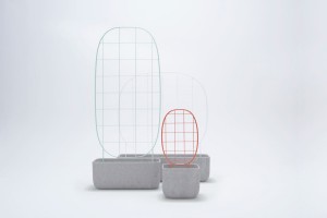
The Plantrellis collection isn’t your average terracotta planter, or worse, the faux kind made out of plastic. These concrete planters, designed by Luca Nichetto for Berga , are simple with subtle, open wire trellises that don’t distract from the beauty of the plant. Plantrellis’s can be lined up or arranged to create a “horizon” or even a pathway
Follow this link:
Plantrellis by Luca Nichetto for Berga
Tags: Modern Furniture
April 21st, 2013 — Design

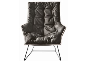
This chair isn’t just named the Maserati chair , it’s actually a Maserati chair. Designed by Italian design firm Zanotta for the car brand Maserati, for a cool $5K you can say you own a Maserati. In your living room, that is. Part of Maserati’s lifestyle brand and one of the initial products in their new Home and Office collection, it expresses the “made in Italy” spirit and values: a sign of style, comfort, craftsmanship and state-of-the-art materials and shapes, which never loses sight of the tradition of timeless elegance
Visit link:
Maserati Lounge Chair by Zanotta
April 20th, 2013 — Design

We partnered with Crane.tv to bring you some fantastic videos that feature some of this year’s biggest names in Milan. With distinct Italian flair, Milan-based designer Fabio Novembre imbues every object with unique intention. Take a tour of his house and studio, and hear him talk more about design
Link:
WATCH: Fabio Novembre – Living in Eden
Tags: crane, Modern Furniture, result
April 20th, 2013 — Design

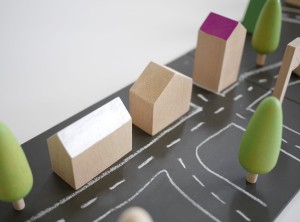
Machi is a minimalist children’s toy designed by Japanese-based firm Kukkia . Kukkia means ‘to bloom’ in Finnish and ‘kuki’ means stem in Japanese. The focus of their products is to provide children with tactile and vividly-colored shapes that are both fun and visually stimulating. They want kids to get involved and to use their imaginations to create, change and re-invent how toys are played with. Machi is a clear example of Kukkia’s desire to motivate children to use their imaginations
Visit link:
Minimalist Children’s Toys: Machi by Kukkia
Tags: Modern Furniture
April 20th, 2013 — Designer Stuff

TGIF. Here’s this week’s Weekly Six:
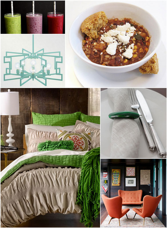
1 – I can’t stop making smoothies. Here are three unique recipes I have to try!
2 – Love this light – do you believe it’s a DIY?
3 – This Cinnamon Peach Chili is one of my go-to recipes – making it tonight, in fact!
4 – Admiring the kelly green accents on this bed.
5 – Easy and fun DIY napkin rings.
6 – Fabulous coral-orange furniture in a gorgeous space.
Our thoughts and prayers go out to all of those in and around Boston – what a scary week this has been for them.
Continue reading here: sixdifferentways.com
Tags: Modern Furniture
April 19th, 2013 — Design

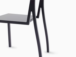
Nendo designed this chair for Moroso where the line of the back legs and their connection to the backrest give this chair the silhouette of a high heel. The chair was launched in Milan during Salone del Mobile. Photos courtesy of Nendo.
View original post here:
Stiletto Style: Heel Chair by Nendo for Moroso
Tags: backrest, moroso, photos
April 19th, 2013 — Design

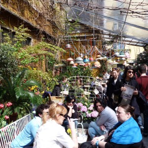
If Ventura Lambrate was my favorite space at Milan Design Week last year (and again this year!), my favorite new discovery was definitely Spazio Rossana Orlandi – especially as I even spotted the lady herself. The space has a buzzy cafe culture ambience and there’s a sense that something different is always happening here. A little exploration led me to the Bala Side Tables by Jaime Hayon – I love the luxurious copper and marble set against the pitted unfinished wall behind. Scholten and Baijings’ collaboration with Hay seems to me like a match made in neon geometric heaven, and this display of their work did nothing to convince me otherwise
Continue reading here:
Milan 2013: Spazio Rossana Orlandi
Tags: discovery, Modern Furniture, orlandi, result
April 18th, 2013 — Design

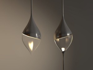
The Stalasso pendant lights, designed by Belgian designer Joeri Claeys , resemble hanging drops. Inspired by dripping stalactite, those icicle-shaped minerals that hang from caves, the pendants can be hung alone or with multiples on one string. The concept was designed with two versions in mind: a gloss/transparent one and a matte one.
Read more:
Stalasso Lighting by Joeri Claeys
Tags: Furniture, minerals, pendants, result, versions
April 18th, 2013 — Design

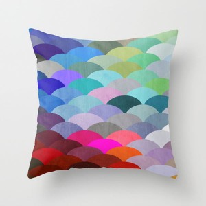
I’ve picked some pretty patterned pillows for this week’s The Design Milk Dairy roundup. It’s Spring, so many of you might be Spring cleaning, or perhaps you’re changing out some of the Winter decor in favor of something with more color or pizazz (yes, I said pizazz). Well, here you go: Above: Scales by Steven Womack March 1927 by Three Of The Possessed 5050 No.1 by Martin Isaac Drieh by Paola Fischer In an ongoing effort to support independent artists from around the world, Design Milk is proud to partner with Society6 to offer The Design Milk Dairy , a special collection of Society6 artists’ work curated by Design Milk and our readers
Go here to read the rest:
Fresh From The Dairy: Patterned Pillows
Tags: Modern Furniture
