April 25th, 2013 — Designer Stuff

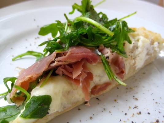
If only pizza crust had ZERO calories, then I would eat this pizza every. single. day. By this pizza I mean the white pizza with prosciutto and arugula. It is the heavenliest of all pizza combinations, in my opinion. And it’s super easy to make!
Unless you make your own pizza dough, which I don’t. I buy the dough from the dairy section – not the frozen kind, but you can use that if you choose. Roll it out while the grill is heating – if you have two sides, do one as hot as it goes and the other at medium heat. If just one side, do medium high. Put the dough on the hot side until it bubbles, then flip it over to the medium side. For now, all you need is some mozzarella – I prefer fresh and shredded combined – and the prosciutto. Close the grill and let the cheese melt and the prosciutto brown. Once you are satisfied, bring the pizza in, throw some arugula on top and serve.
SO easy and SO delicious. Of course, if you want to add sauce you can, but I think it’s better without! You can also dress the arugula with a vinaigrette for added flavor.
What is your favorite type of pizza?
* I didn’t have a good picture of this pizza so the pic above is from here: [Image]
More here: sixdifferentways.com
April 25th, 2013 — Design

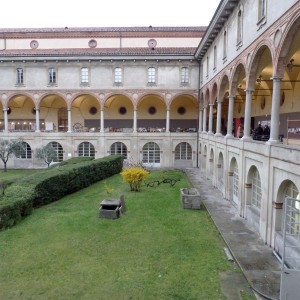
I’m stretching the boundaries of Zona Tortona slightly, to include MOST , which was just around the corner at Milan’s National Museum of Science and Technology, originally built in the 16th Century as a Monastery. But first Zona Tortona proper. These light shades created a calming, white haven from the chaos outside! They are by PINWU , winners of last year’s SaloneSatellite Design Report Award. Next it was on to designersblock , where I spotted this beautifully understated rocking chair by new designer Charlotte Arvidsson .
Continued here:
Milan 2013: Zona Tortona and MOST
April 24th, 2013 — Designer Stuff

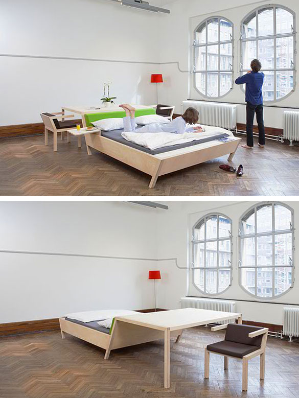
When I first saw this Bedn’Table, it wasn’t love at first sight. But the more I look at it, the more I love it. What an awesome idea for studio apartments – this is a great way to utilize smaller spaces without sacrificing key items – like a table to eat dinner at!
Designed by Erik Griffioen Furniture, the Bed’nTable is made of wood and comes with four chairs and two nightwings – the trays on either side of the bed.
The Bedn’Table would also be great for homes or apartments that are a little bit larger than studios, but still have minimal space. I wouldn’t mind using the table as a desk; wake up each morning and walk five steps to the office!
What do you think of the Bedn’Table? Where do you see it being useful?
Read the rest here: sixdifferentways.com
April 24th, 2013 — Design

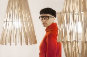
Matali Crasset is no stranger to designing beautiful lighting. Some of Crasset’s lighting is among the most luxurious, and what I like most about this new Stick collection that Crasset has designed for Fabbian Illuminazione , is that it has a bit of a crafty feel to it without losing the luxury or quality. Exploring space, shape and shadow, this lighting collection has it all: a table lamp, a wall lamp, four floor lamps and five suspension lamps featuring four different diffuser shapes
More here:
Stick Lamp Collection by Matali Crasset
April 23rd, 2013 — Design

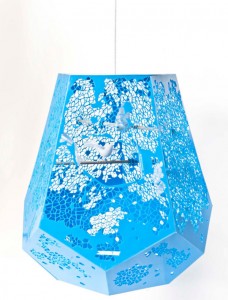
Designer Melody Rees has re-imagined the home in which your fluttering pets take up residence with the Voronoi Bird Cage . The design was digitally printed with a Voronoi pattern embedded into the bright blue material, making it fit into most modern homes. The geometric design is varied but opens up around the center part of the cage to give the birds an optimum view while looking out. The organic texture of the pattern is meant to make the bird feel at home with shadows being cast through the holes much like the sun falls through the branches of a tree. The design flat Pattern
More:
Voronoi Bird Cage by Melody Rees
April 18th, 2013 — Design

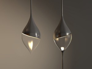
The Stalasso pendant lights, designed by Belgian designer Joeri Claeys , resemble hanging drops. Inspired by dripping stalactite, those icicle-shaped minerals that hang from caves, the pendants can be hung alone or with multiples on one string. The concept was designed with two versions in mind: a gloss/transparent one and a matte one.
Read more:
Stalasso Lighting by Joeri Claeys
April 18th, 2013 — Design

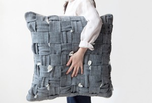
Can’t sit still? Do you bite your nails? Maybe the HUHU pillow can help. Designed by cool enough studio , the new design studio of Saehee Her (remember, we featured her Brighten entertainment center ), the HUHU might help you sit still. Although at first this looks like a regular pillow with some tiny flower decorations, the design is, in fact, much more strategic and interactive than that
Go here to read the rest:
No More Idle Hands: HUHU Pillow Perfect for Fidgeters
April 17th, 2013 — Designer Stuff

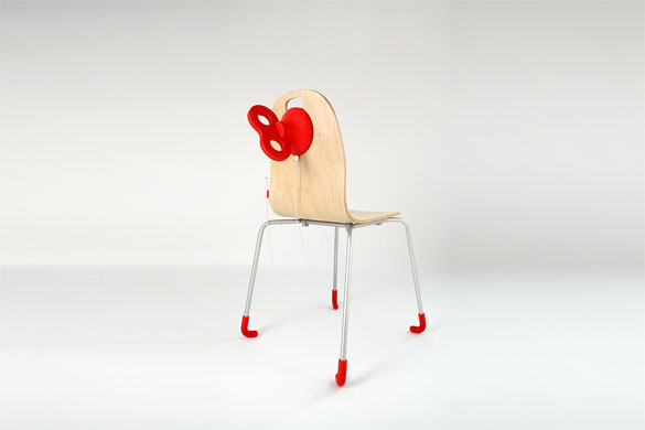
Wouldn’t it be nice if you could take a seat and be instantly wound up with more energy? If only that’s what this cheeky Wind Up Chair could do!
Although this modern chair can’t wind you up with this energy, it can provide energy for your mobile phone. Designed by PEGA, the wind-up button on the back of the chair has a hidden plug in for your charger. All you have to do is give the winder a few spins and your phone charges as it unwinds.
Wouldn’t the Wind Up Chair be great in cafes for patrons to charge their phones while they work, eat, socialize?
April 17th, 2013 — Design

Students in a “research by making” thematic design studio at Rotterdam’s Piet Zwart Institute rolled out projects in which they investigated low-tech appliances and gadgets and then re-imagined them to offer an alternative use. During the exhibition, entitled Altered Appliances , the students presented the kitchen-based designs and showed the process of making. With the kitchen being the most tech and equipment filled room in the home, the students were asked to research hand powered tools and devices and to gain knowledge of one in particular.
See the original post here:
Altered Appliances by Piet Zwart Institute Students
April 16th, 2013 — Designer Stuff


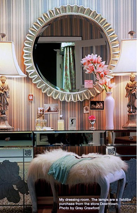
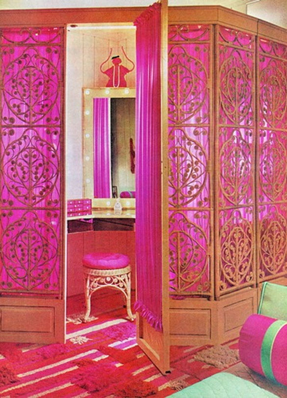
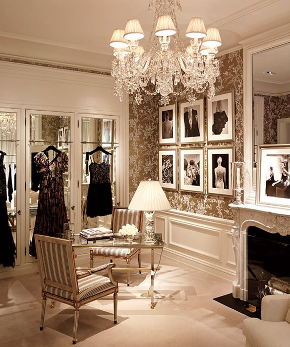
The other day on the radio, they were talking about creating a lady cave. I’ve heard of man caves, but somehow I’ve never heard the term lady cave until last week! Have you heard of it before?
It only makes sense, because if the man gets one, the lady should too. The real question is, what would you have in your dream lady cave? For me, I’d have a big vanity with tons of fabulous makeup and hair products and accessories with a fancy mirror and fabulous chair for getting ready. Then I would probably have a hot pink tufted sofa with some fur and lucite accessories scattered around and a beautiful flat screen hanging on a patterned wallpaper wall.
That’s my dream lady cave. Now I just have to find a room for it all. What would be in yours?
[Images 1 - 2 - 3]
Read the original post: sixdifferentways.com
