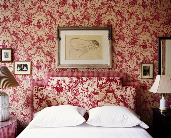
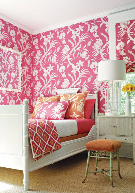
This morning while going through my Google reader, I saw the first image on Desire to Inspire and then the second not too long after over on Material Girls.
They got me thinking about being all matchy-matchy. I like the monochromatic look, but I’m not sure I like the matching look. Would you agree that they’re two different things? The difference to me is that monochromatic would be an essentially solid red wall with an essentially solid red headboard and a matching look would be the image above – pattern to pattern. I guess it doesn’t really matter in real life, but talking about it here makes it easier!
In the second image, the pattern is repeated in several places. Not only is it the wallpaper, but it’s framed as wall decor, in two different colors as pillows and it’s used in the window treatments.
Do you love the matchy-matchy look? Do you prefer monochromatic or could do without both?
Continue reading here: sixdifferentways.com


