May 21st, 2013 — Designer Stuff
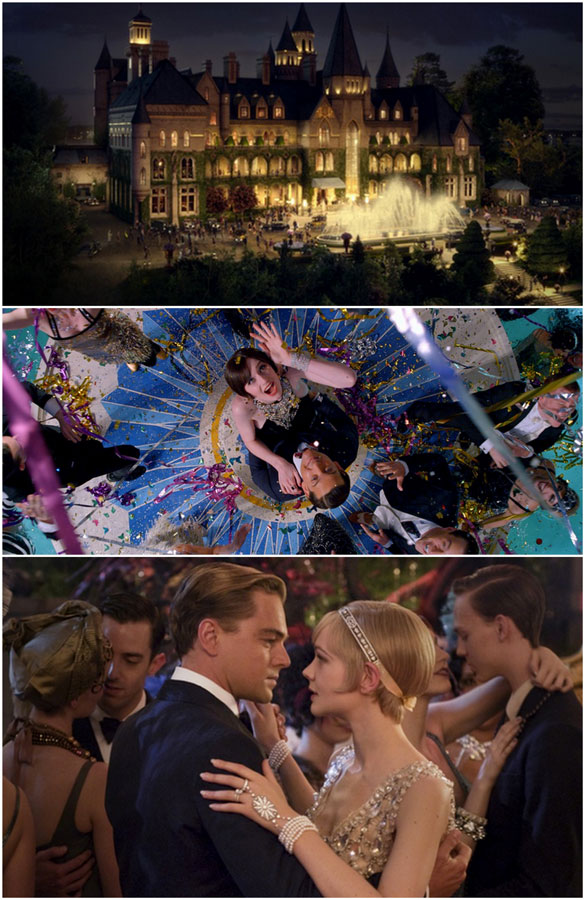
Ok, so last week we talked about The Great Gatsby and how I was dying to see it. Luckily, I was able to catch it this Saturday – in 3D – and I was not disappointed. Has anyone else seen it?
Don’t worry – I’m not going to talk about it and how great I thought it was. What I really want to talk about is the collaboration between Tiffany’s and the movie. Ironically, I had been on the Tiffany & Co. website on Saturday morning because I was looking at a gift idea for someone. On their homepage, there was a link to the video above, which of course side-tracked my gift hunt.
It’s really interesting and quick to watch – it talks about how Tiffany & Co. let the costume designers of The Great Gatsby dive deep into their archive to use pieces for the movie. I was so excited to find this video before I went to the movie, so I was able to find the pieces while watching.
But how about that headpiece that Daisy Buchanan wears? It can be yours for a cool $200,000! Take a look at all of the pieces available for purchase – which would you choose?
Read this article: sixdifferentways.com
May 13th, 2013 — Designer Stuff

Did you have a chance to go see the Great Gatsby this weekend? I didn’t, but am hoping to go sometime this week.
The elaborate costumes and decor are both things I don’t want to miss. Plus, the story is quite enchanting! And I did have a giant crush on Leo back in his Titanic days, so seeing him as Gatsby won’t be so bad either!
Can you imagine living in this era? It would be so fun to dress up like that – we’re so casual these days!
If you saw Great Gatsby, what did you think??
[Images]
Read more here: sixdifferentways.com
October 16th, 2012 — Design

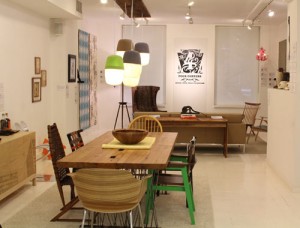
Last month I mentioned a great exhibition taking place during DesignPhiladelphia called Four Corners: Design from Philly Surrounds . I had the chance to check it out this past weekend and I would highly recommend if you’re local to Philadelphia that you stop in to Minima Gallery before the exhibit ends on October 20th. If you can’t make it, then here’s a peek: Sideboard by Michael Iannone A variety of local chairs surround a gorgeous table by Bench Dog Design Mio ‘s felt chandelier made using old hat molds Coffee table by Adam Rung with a George Nakashima chair in the background and Philadelphia pillows by Bhaval Shah Bell Cartoloji in the foreground Great wallpaper from local artists including Aphrochic Chandelier by Adam Wallacavage Sk8 chair by Toby Mcqueston Great photo and frame by John Murphy Gorgeous gilded skull by Candy Depew Signals Papercut by Joe Boruchow (he is awesome !!!) There is so much more to see, though, so hopefully you can pop in and see it
See the original post:
Four Corners Philly Exhibition
September 6th, 2012 — Designer Stuff


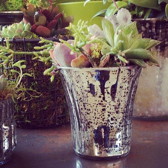
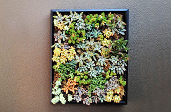
While working with a florist for my wedding next year, I came across a beautiful bouquet that she had done for a recent bride. What made it so beautiful and different was a few neatly placed succulents within the bouquet. It really looked amazing. So, that got me thinking about all of the different ways there to arrange succulents throughout your home, rather than just sticking a few in pots. Which looks great, don’t get me wrong – but it’s always fun to switch things up a bit, right?
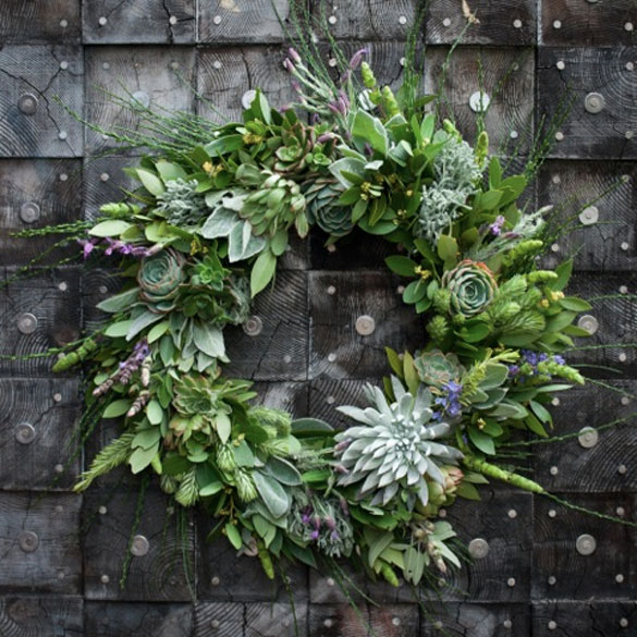
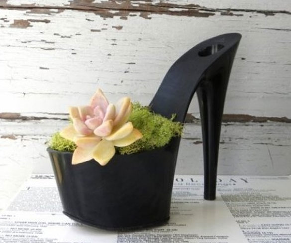
And while a terra cotta pot looks nice, a mercury glass one looks even better! You can go vertical with your succulents and make a lovely wreath or a wall art display with them. Or, for the girly girl – stick those succulents in a high heeled planter.
I’ve been thinking about adding some succulents to my home, so maybe I’ll have to try one of these fun ways. What about you – what interesting ways have you seen succulents on display?
[Images: 1 - 2 - 3 - 4]
Read the original: sixdifferentways.com
May 30th, 2012 — Design

While in New York, we visited the Mondo Collection showroom, a company that is dedicated to bringing modern global design to the US, as well as collecting exceptional designs from up-and-coming designers. We got an exclusive tour of the space and had a great time speaking with Jaime Hayon and up-and-comer Jack Craig .
Excerpt from:
A Visit to Mondo Collection
May 25th, 2012 — Design

Boy, those girls from Sight Unseen sure know how to put together a fun series of events. We had a great time walking around Noho this year. I made it a point to go this year because unfortunately last year I missed it.
Read more here:
NY Design Week 2012: Noho Design District Part 1
July 12th, 2010 — Design

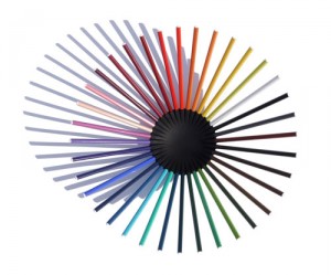
Michiel Cornelissen Ontwerp has created some great jewelry designs, such as the A Bit Cross and bird cage jewelry . Now, he’s branched out into home decor using a unique materials: colored pencils. His 36 Pencil Bowl and 30 Pencil Icosahedron lamp are a fun DIY project — you purchase the connector and then buy whatever color pencils you wish, from the standard yellow to a rainbow of colors. © 2010 Design Milk | Posted by Jaime in Home Furnishings | Permalink | No comments | Tweet This | Share on Facebook
See the rest here:
Michiel Cornelissen Ontwerp
September 12th, 2009 — Design

The bagalights from Liqui Design are certainly something. I think this is a great design, although I’d be so afraid the bags would catch fire. http://www.liquidesign.co.uk
Read more from the original source:
Bagalight
