May 1st, 2012 — Designer Stuff


Digging for a gold lamp, that is.
As I was searching for images for this post, I realized I have a serious addiction to gold lamps. There’s nothing wrong with that right? Guess that just means I need to put one in my home so I can stop continually blogging about them!
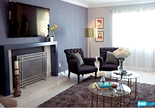
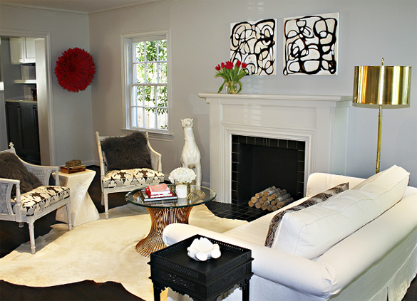
Anyway, I saw the first gold lamp on Bravo’s Interior Therapy with Jeff Lewis. Do you watch that show? Last week was the first time I’ve tuned in and I wouldn’t mind watching it again this week. I’ve been dreaming about that lamp since I first saw it and I can’t find it anywhere. Except in that second image. I thought perhaps Bravo would have it sourced on their site, but I didn’t see anything.
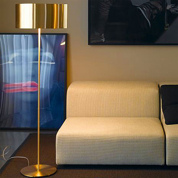
Finally, I found the third lamp, a very similar style, on a Danish website which then led me to an US site. (Which told me that the lamp is over $2,000! Total bummer.) After that, I gave up my search and started looking for glossy gold spray paints to create my own version of this lamp.
My question is – what do you do in situations like this? Have you ever searched high and low for something you’ve seen on television or another outlet? It seems that with the Internet finding such things can be pretty attainable, but what happens when you don’t find what you’re looking for that easily or affordably? Do you then DIY it?
I’d love to hear your thoughts!
[Images 1 - 2 - 3]
Read more here: sixdifferentways.com
April 18th, 2012 — Design

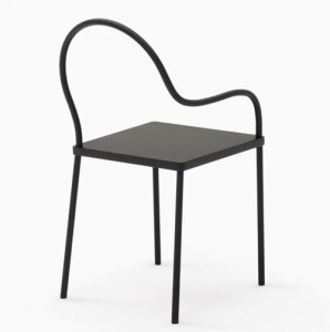
Japanese design collective Nendo , with design director Oki Sato at the helm, is launching its new collaborative brand K% with a collection entitled black&black . This is Sato’s first collection as the director of K%, a furniture brand from Singapore, but as the founder of Nendo, he has a keen eye and desire to make pieces accessible and affordable. The pieces in the line are all black and offer a stripped down approach to design where they avoid the “distraction of new materials, technique and color.” Collaborators on this collection include Studio JuJu and Exit Design . They each contributed one item. This particular collection will debut at Salone del Mobile 2012 in Milan and they anticipate collaborating with more designers in the future for new collections.
Follow this link:
black&black Collection from K% for Nendo
April 17th, 2012 — Designer Stuff


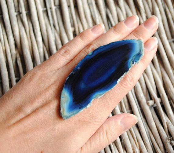
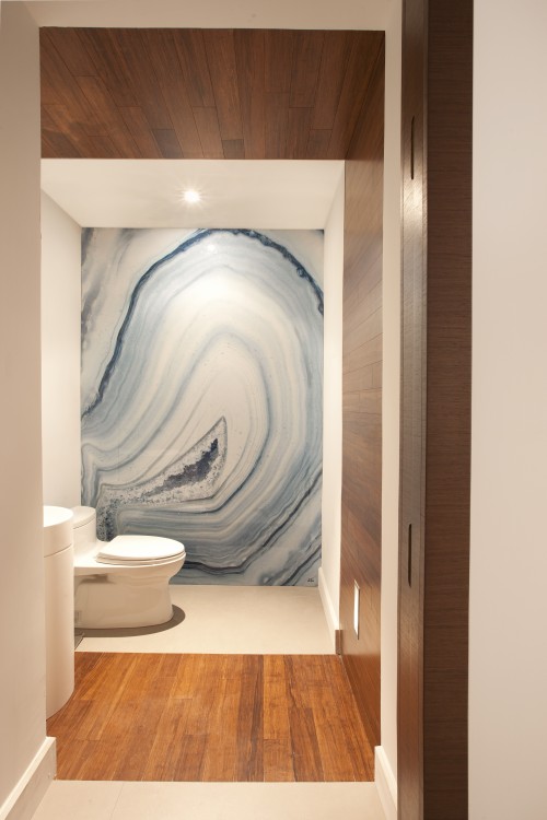
I love the look of agate in almost any way because of the beauty it provides in so many different shades. If you absolutely had to choose which way to show your agate pride, would you rather wear it on your finger or on your bathroom wall?
Obviously, a ring is a switchable agate accessory, but how gorgeous is that bathroom?
Images: 1 / 2
Original post: sixdifferentways.com
March 31st, 2012 — Design

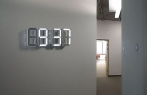
The White & White Clock is designed by Vadim Kibardin and is meant to be a three-dimensional version of a traditional digital clock. We featured the original black and white incarnation years ago , but this new updated one is even more fantastic. It’s wall-mountable or props up on your desk or table with the attached kickstand
Original post:
White & White Clock by Vadim Kibardin
March 30th, 2012 — Design

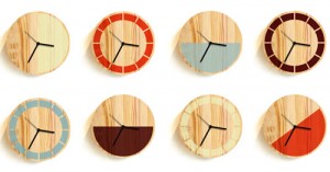
Made from Douglas fir with a screenprinted face, the Primary Clock was designed by London-based David Weatherhead and GOODD for Thorsten van Elten . The circular clock comes in two styles, one with a half circle of color and the other with segmented blocks of color. The half circle style can be hung three different ways displaying the color part either on the bottom, the right side, or at an angle.
Go here to read the rest:
Primary Clock by David Weatherhead & GOODD
March 17th, 2012 — Design

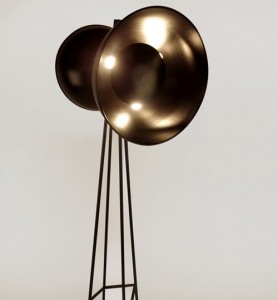
From South Korean designer Jiwoong Jung comes two lighting fixtures, GYOGAM and ZIGZAG . Taking inspiration from power line towers and speakers, the GYOGAM floor lamp resembles the tower structures you see everywhere. The lamp is lit on both sides through the two dome-like fixtures. I definitely get the speaker vibe from it and almost expect music to come pouring out, but I love the diffused glow of the light that it creates. I don’t think I’d recommend sticking your face in the fixture when the light is turned on! The ZIGZAG is the ceiling-mounted version of the GYOGAM .
Read more here:
GYOGAM & ZIGZAG by Jiwoong Jung
February 7th, 2012 — Design

Jaime Hayón has created The Guest for Lladró Atelier , launched at Maison & Objet . Founded in 1953 by brothers Juan, José and Vicente, Spanish ceramics brand Lladró is well-known for its porcelain figurines. Artistic Advisor to the board, Jaime Hayón began working with Lladró in 2006. His latest project is a platform for collaboration between Lladró Atelier and artists from all over the world; American multi-disciplinary fine artist Tim Biskup and Devilrobots , a five-man design team from Japan. His original porcelain character provide an almost blank canvas for the artists to imbue with their own ideas, creating a range of distinctive characters. Good friend of Jaime Hayón, Tim Biskup was born in Santa Monica in 1967
Read the original post:
Jaime Hayon’s The Guest at Maison & Objet
February 5th, 2012 — Design

One of the stand-out pieces at Maison & Objet for me was Doreen Westphal’s concrete lace curtain . Not only visually stunning, it plays with our conception of gravity, delicately suspending something we perceive to be very heavy in mid-air. The design is based on an old lace pattern from Belgium, which Doreen translates into a digital file. From this she creates a mold using plexiglass and silicone
Continue reading here:
Concrete Lace by Doreen Westphal at Maison & Objet
February 2nd, 2012 — Design

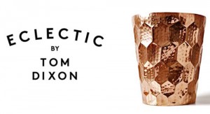
Tom Dixon was born in 1959 in Sfax, Tunisia and moved to England when he was four years old. Having been educated in London, and completed a six-month stint at Chelsea Art School, a career in music followed before a motorcycle accident provided him with the time and welding skills that would lead to his design career — a career that has produced some extraordinary designs we’ve come to know and love. Fast-forward a couple of decades, via Habitat, Artek, his own shop, Space, and an OBE for services to design; Tom Dixon the company was born, and the rest, as they say, is history. Chop Rectangle, Chop Long and Chop Paddle, each milled from solid oak with a soft curved edge Tom Dixon was showing for the first time at Maison et Objet this year to launch Eclectic by Tom Dixon, a collection that’s described as “Things that are to play with or give or use everyday, things that are designed and are undesigned, things that are… eclectic.” Clockwise from top left: Hex Bowls, Bash Vessels, Form Bowl Set, Cast Mini Jack Cast Factory, a money box for industrious savers, modeled on a British factory from the Industrial Revolution era, and Cast Shoe, a classic English gentleman’s brogue cast in solid aluminium with a copper plated finish.
Go here to see the original:
Eclectic by Tom Dixon Launched at Maison & Object
September 27th, 2011 — Designer Stuff

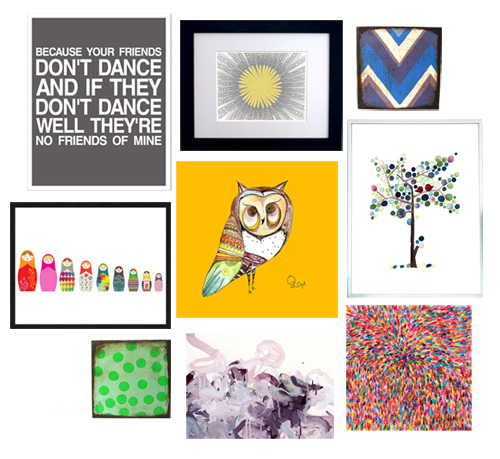
There are so many art-related items on Etsy. SO many. Inspired by a gallery wall of art, I had to narrow it down to Giclee prints for this round up or else I would have been on Etsy all week. From the nine images above, you can tell there’s a great, diverse collection. For those of you wondering what the heck giclee is, it’s a printing process that uses archival inks. It is often used in museums and by artists duplicating paintings or other textural work.
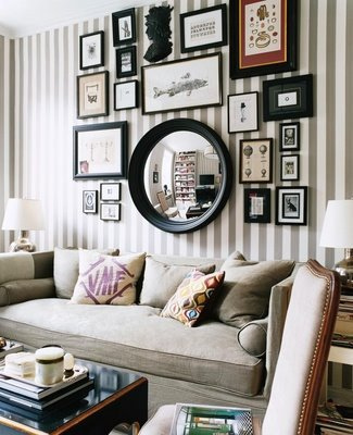
Even though I like the all-giclee gallery above, I think I would branch out a little in my own home. Adding different textures to the wall, such as paintings or shadow boxes would bring in some texture. As would a mirror, as seen in the gallery wall below.

via Modern Jane
What are your thoughts on gallery walls? Do you like them – or do you think they’re too much?
The prints shown above (from L to R): 1 / 2 / 3 / 4 / 5 / 6 / 7 / 8 / 9
See the article here: sixdifferentways.com
